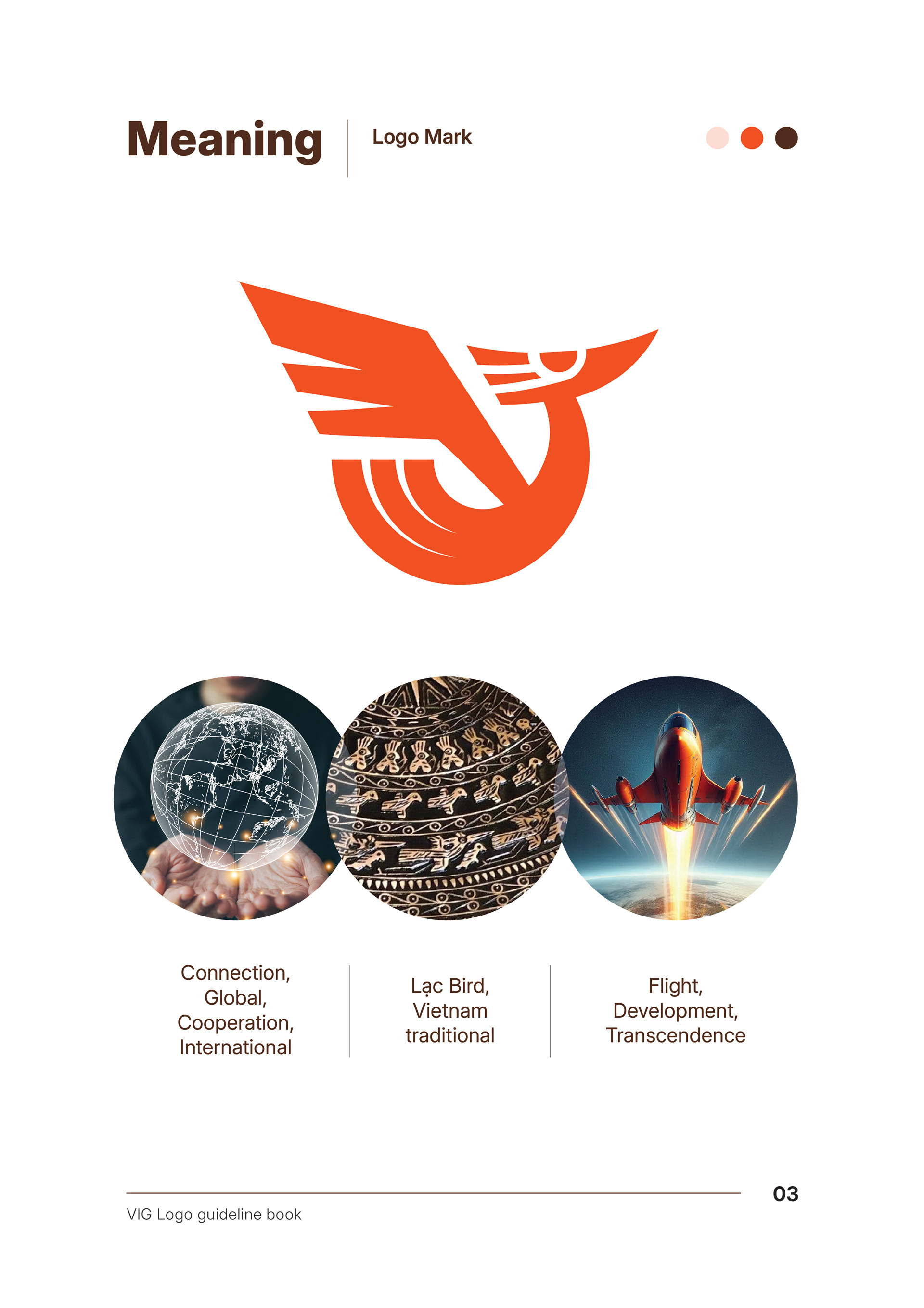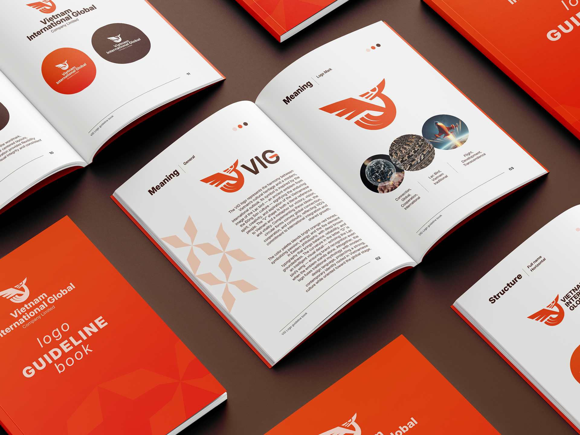


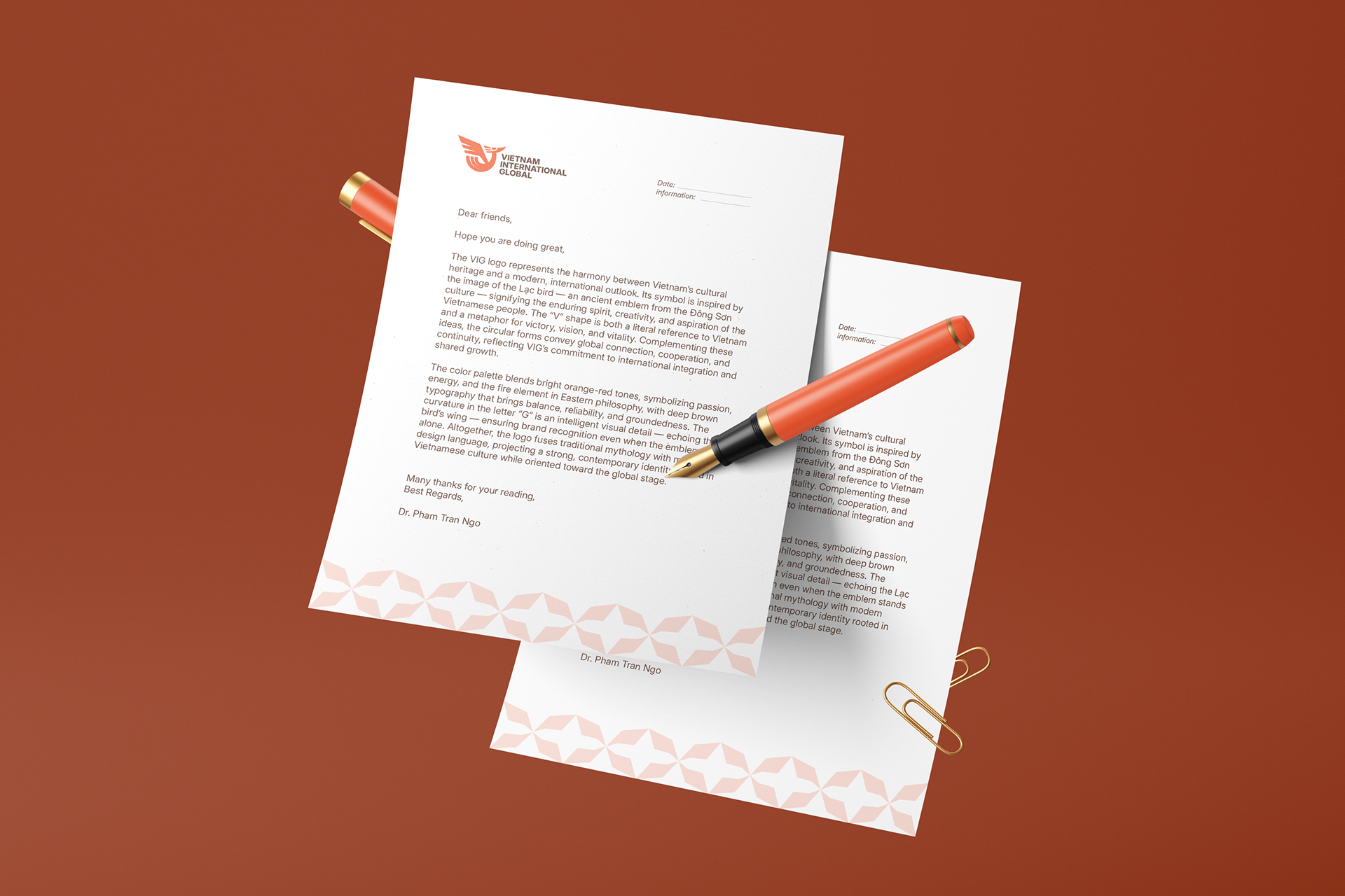
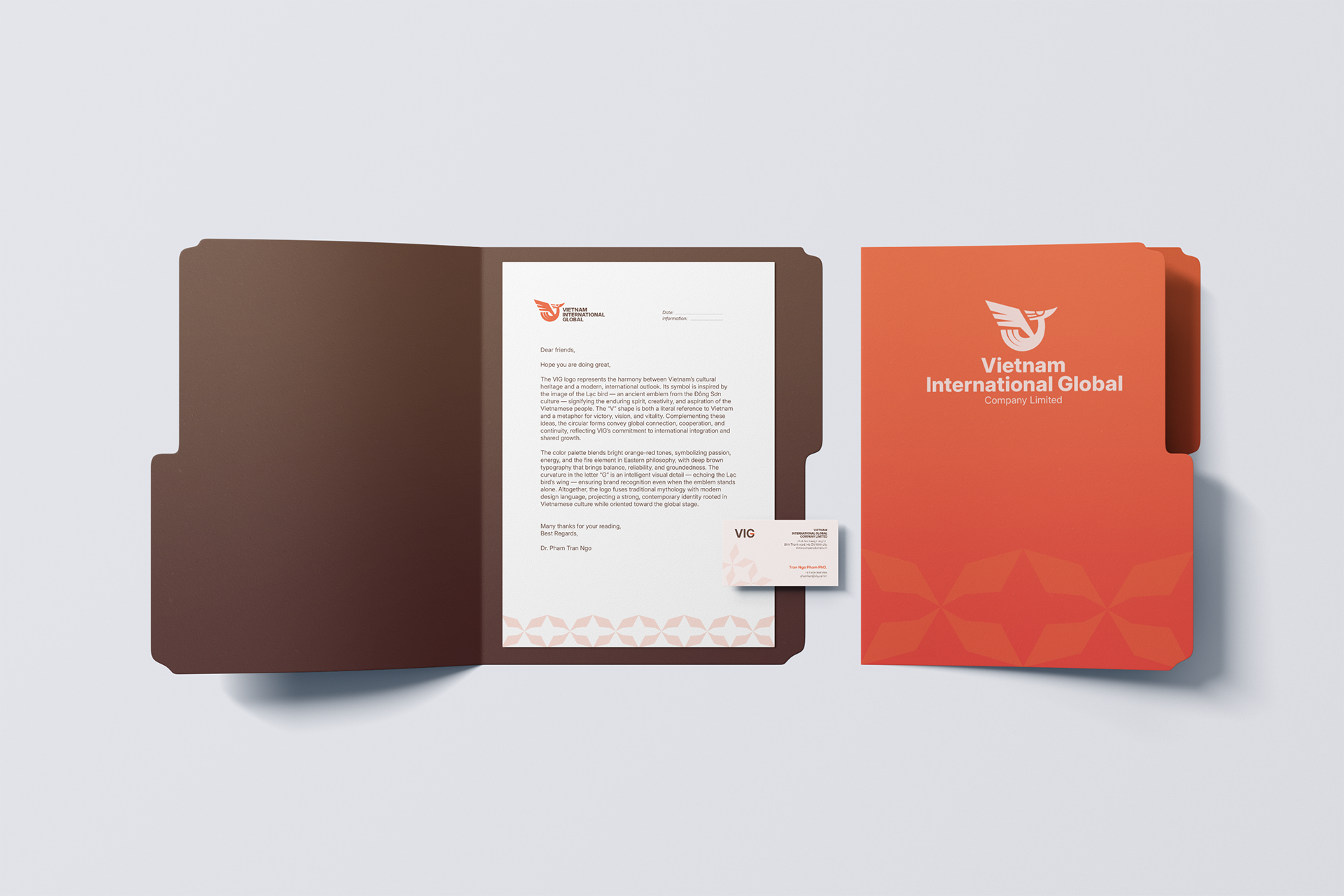
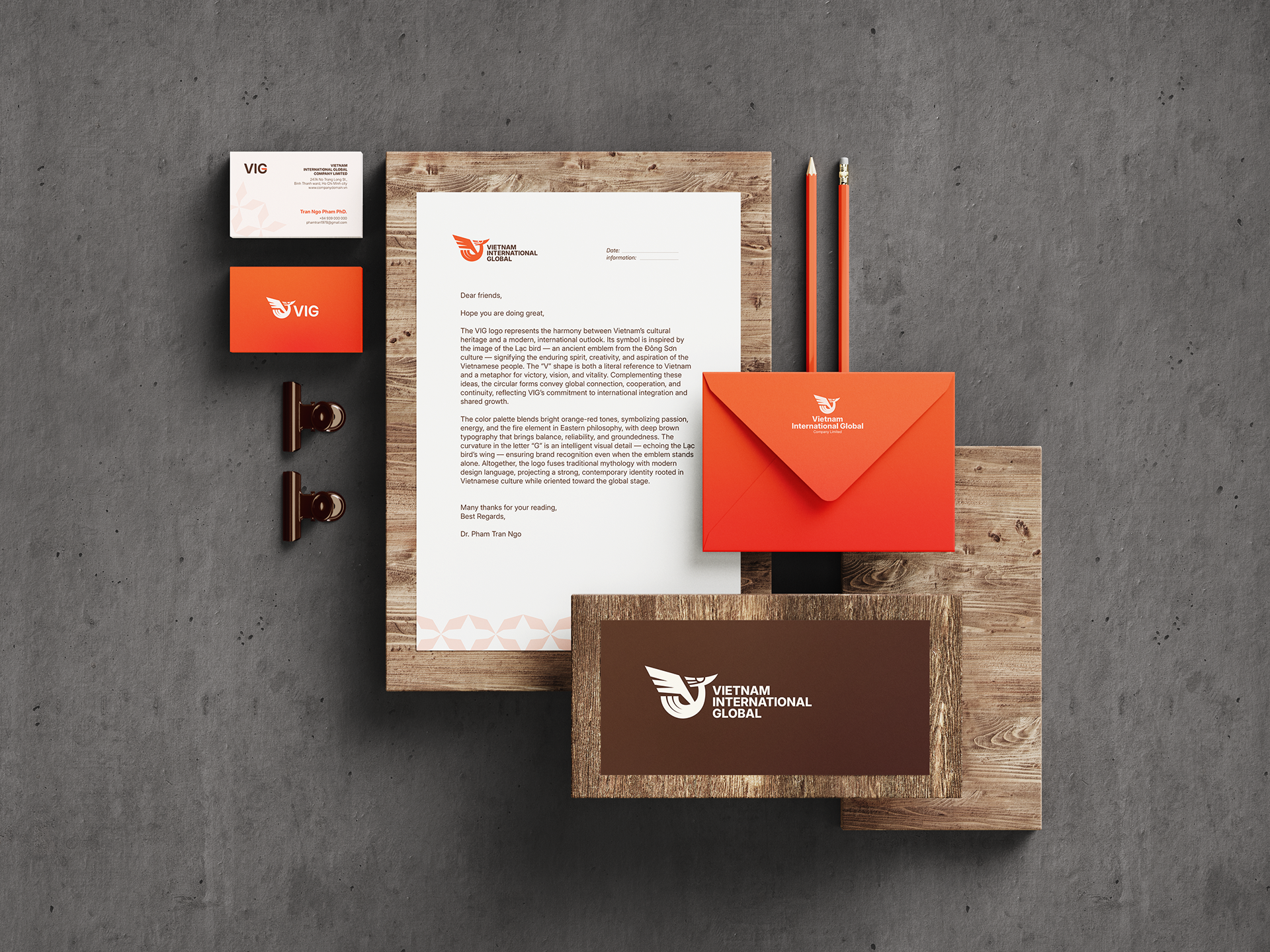
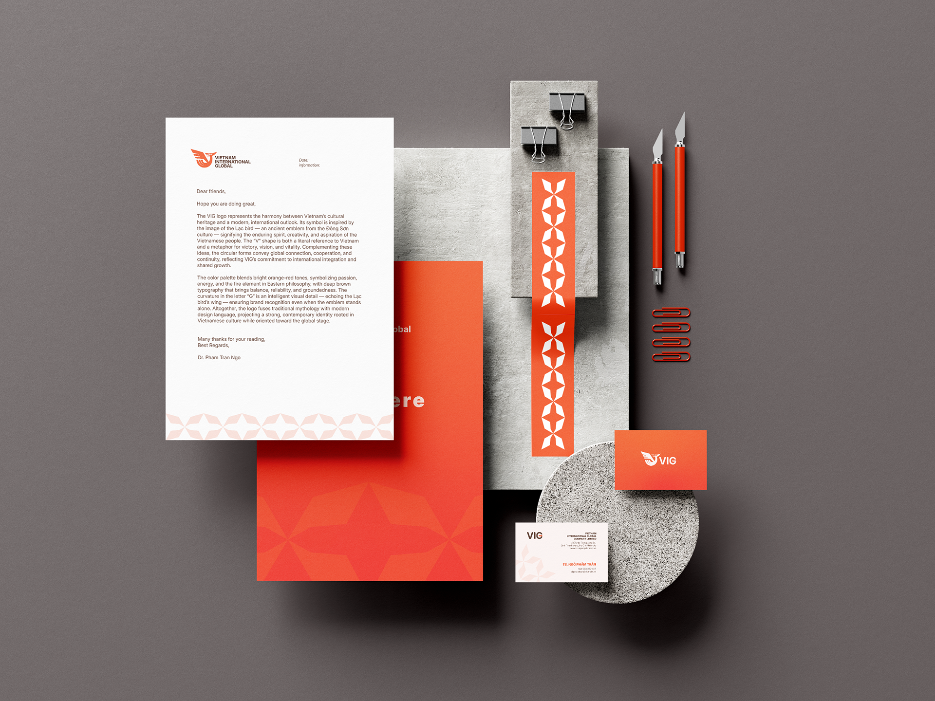
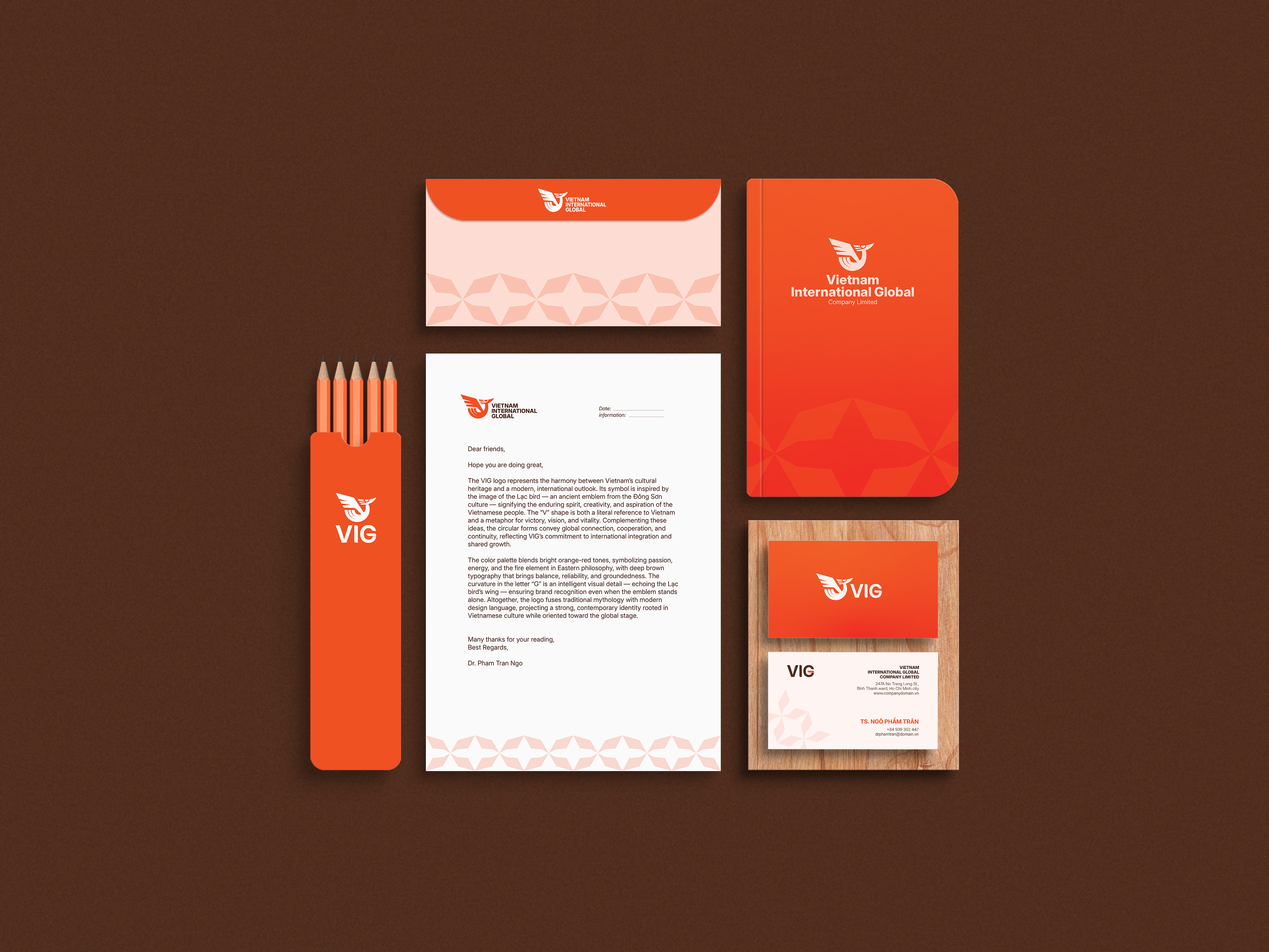
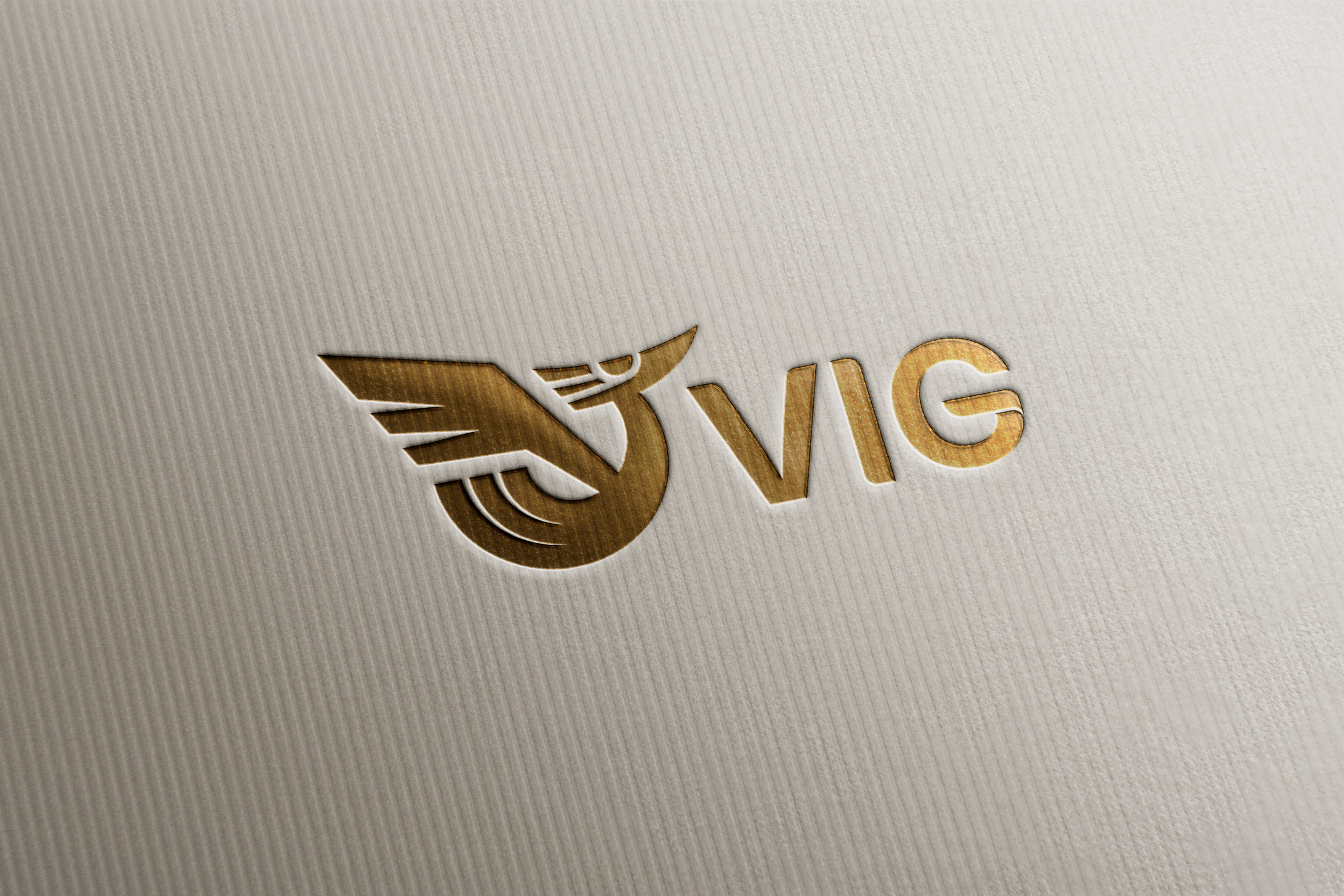
The VIG logo represents the harmony between Vietnamʼs cultural heritage and a modern, international outlook. Its symbol is inspired by the image of the Lạc bird — an ancient emblem from the Đông Sơn culture — signifying the enduring spirit, creativity, and aspiration of the Vietnamese people. The “Vˮ shape is both a literal reference to Vietnam and a metaphor for victory, vision, and vitality. Complementing these ideas, the circular forms convey global connection, cooperation, and continuity, reflecting VIGʼs commitment to international integration and shared growth.

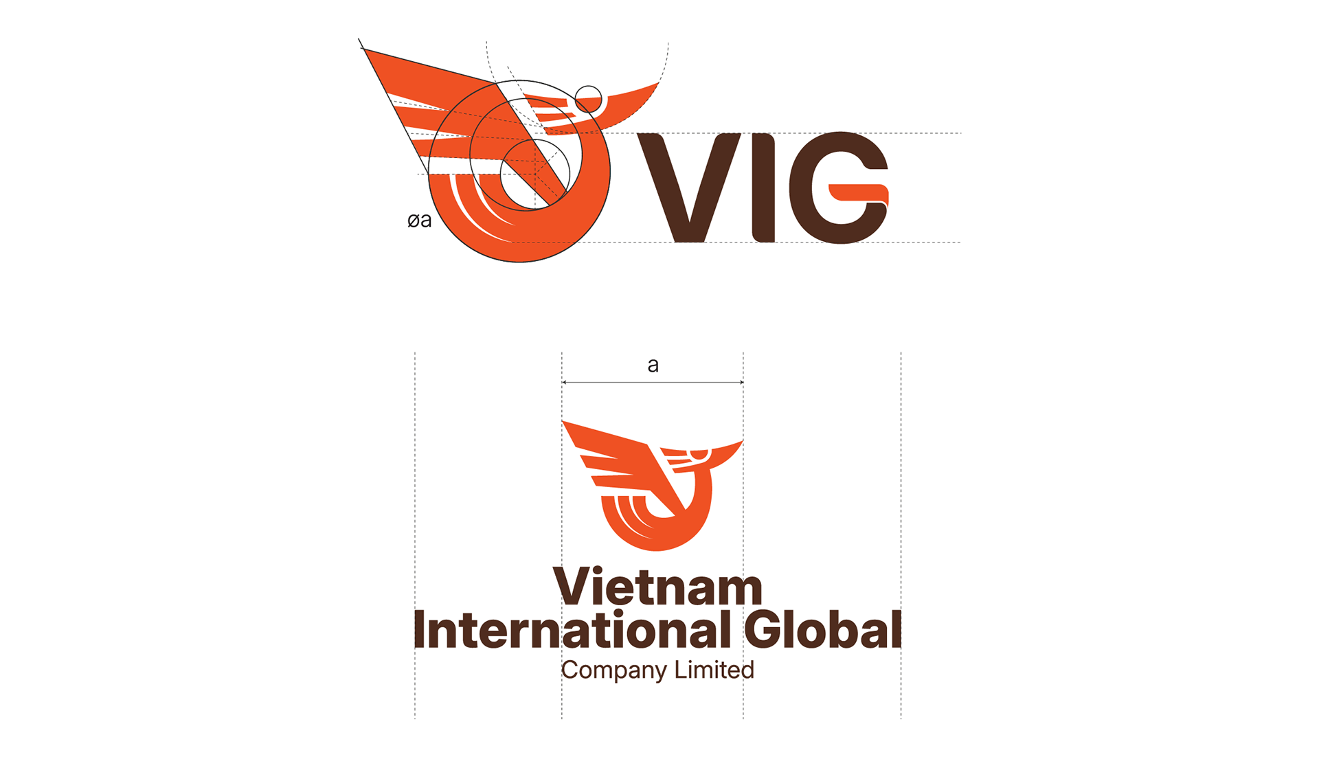
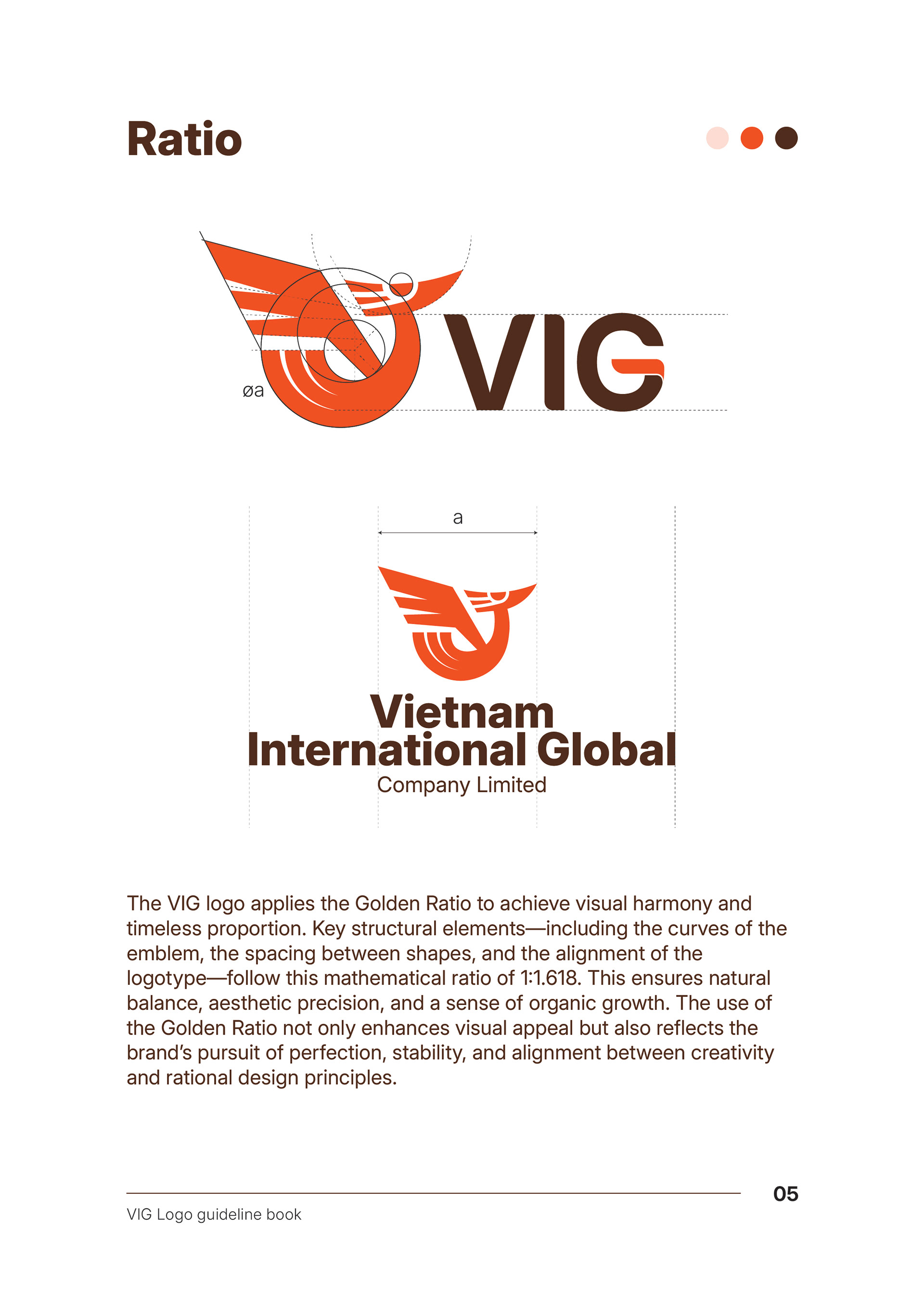
The VIG logo applies the Golden Ratio to achieve visual harmony and timeless proportion. Key structural elements—including the curves of the emblem, the spacing between shapes, and the alignment of the logotype—follow this mathematical ratio of 1:1.618. This ensures natural balance, aesthetic precision, and a sense of organic growth. The use of the Golden Ratio not only enhances visual appeal but also reflects the brand’s pursuit of perfection, stability, and alignment between creativity and rational design principles.

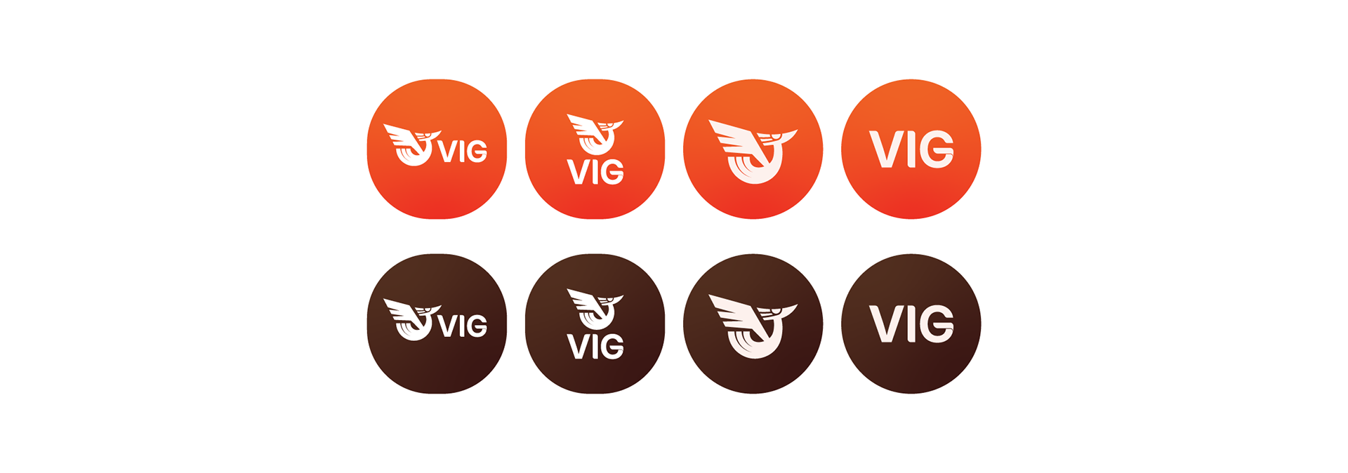
The Original version is the brand’s primary and official configuration. The symbol aligns beside the full name, expressing balance, authority, and clarity. It is used across all major applications—print, digital, and signage—ensuring consistent recognition and representing the brand’s core identity.
logo guideline book
——————————